Tuesday 12 May 2015

Final Version for my Contents Page

 
After receiving some feedback, I have added page numbers, and I have also aligned the text. I have also got rid of extra blank space. I have also cropped my photos to get rid of the boring backgrounds. I have also added page numbers and quotes to my pictures so it is obvious what articles they go with. I have also added page numbers to my articles and changed the font and colour of the "regulars".

Final Version of my Double Page Spread


After receiving some feedback for my Double Page Spread, I realised that I had to much blank space!
So I sorted this by making the bit that says "Black Out" and "The Lights are Off" and by moving them closer and I added a fact file of the band to get rid of the space and make it more interesting.
I also made more space around my quotes. I also added a page number to make it easier to go to that page. I also made a quote larger and moved it to the picture so it tied in with the article.


Final Version Front Cover.

 
After receiving some feedback, I changed the colour of the cover lines on the top left to yellow, with a black outline, to make them standout more. I think this is effective as it makes them stand out more and adds more dimension to my final front cover.
I also added an issue number and date, as originally I had forgotten to do this. I also put it in bright red to make it easier for potential audiences to notice and make it easier to tell what edition it is.
For "Greatest British Bands Ever" I changed it to a bolder red font to make it easier to read, I also moved the words closer together to get rid of wasted space.
I did also move "Live Kasabian" further down so it wouldn't get mistaken as being the connected to the "Album Title." 

Tuesday 14 April 2015

Evaluation Question 1.

In what ways does your Media product use, develop or challenge forms and conventions of real media products? 


Friday 10 April 2015

Evaluation Question 5.

How did you attract/address your audience? 


In order to attract my demographics i used a series of forms and conventions which were influenced and observed by my case study magazine and through market research. 

The Masthead is a major part of my brand identity which my audience would associate with my company so my masthead design had to be representative of my company but also reflective of my demographic. Starting with the colour scheme of my masthead, i looked a other magazines colours and the relating genre- such as Q was red and Kerrang also. This is also a similar type of music to the one my magazine is about, and so related to the colour schemes. I did this so that i could get  abetter understanding of the implications and associations in which is portrayed with particular colours, therefore allowing me to manipulate certain ideologies of that colour onto my brand image. 
From my market research i found that younger audiences tend to opt for bright, bold colours which can grab their attention quickly, whereas older demographics tend to go for dimmer, darker colours which are gentler on the eyes. Using this information i decided to use a darker colour which would be seen to my demographic, i decide to use the colours white, with red and yellow. These are mature colours as it is a maturer magazine, so matches my target audience. 

An additional way in which i address my demographics was by using the feedback and results i received in my questionnaire. The contents page of my magazine includes features such as festival listings, gigs and band reviews. I have also included names, interviews and features of popular artists which will be well known to my chosen audience. 

I tried using lots of different text to see what fitted my genre the best. Whilst doing my research i noticed that most Alternative Music Magazines used bold writing or just plain writing, such as Ariel. I did like them both very much, so much that i decided to use them both, but mixed, so my text was easy to read but also the writing was formal. I decided to have the Masthead behind the models head because whilst researching i noticed that alot of magazines did this. I really liked this, and thought it suited my genre.

A further way apart from using font and colour to attract my target audience is the use of pictures. Certain photographs won't attract my target audience, such as if it was someone dressed in pink, smiling. This type of photo wouldn't be appropriate to my target audience. That is why all of my cover models and my images, look grungy and moody to create an 'alternative' music atmosphere. I learnt this through my feedback and questionnaire. 


Evaluation Question 6.

What have you learnt about techniques from the process of constructing this product? 


From the construction of this product we started by learning how to use our blogs. This meant that we could post our work and ideas to it. Also, for guidance we can look at other students blogs which can influence our own ideas. 

First of all we used a programme called Serif Photo Plus. This enabled us to edit photos that we wanted to put into our products. For example in my double page spread i have a photo which i edited the back ground to be black and white, whilst the models were in colour. This enabled me to do so. This has given me a new skill set, with which to edit photos to make them of a professional, magazine standard.

Secondly i used a blog site, called Blogger. As mentioned before we started our coursework process by learning how to use Blogger.  Blogger enabled me too post my progress and eventually my finished products. I used blogger to type my ideas and eventually post up all of my magazine research and designs. Blogger is the main programme i have used to present my coursework. Over the course i have become well-equipped with using Blogger, and now use it with ease and find it a very simple, effective programme. 


Prezi- is also a programme i have dabbled in. I have only used it a couple of times, but i do find it a very effective programme. I have found it harder to use than say blogger or Serif, however it is an interesting also unique way to present things in a new way. They also have a great range of layouts and fonts etc to make every Prezi different! 

Another programme i have used it PagePlus. I used this to create the initial plans for my final products. This was a very useful software as it enabled me to gather ideas about how i wanted my final product to look. It did take me a while to learn how to use PagePlus as it was a completely new idea, that hadn't tried before. I had never come across it before, but now that i know how to use it, it is extremely useful for envisioning the ideas you have! 


It did take me a while to use the programmes, as i had to learn how each individual worked and get my head around the whole process! But now  i know how to use all of the programmes, effectively and to my advantage. 


Evaluation Question 7.

Looking back at your preliminary task, what do you fell you have learnt in the progression from it to the full product? 

Looking back on my preliminary task, I have learnt various new technical skills as well as how to create a successful product. My preliminary task was very bland and included no sense of creativity and the contents did not match with the cover. However, in my full product I have ensured a consistent colour scheme in order for all my pages to look as though they’re from the same magazine. My school magazine looked empty whereas my full product has a small amount of writing to match my style model Kerrang!. However, still looked like a legitimate magazine. I feel that since my preliminary task I have progressed as beforehand I did not really understand how to attract an audience successfully. I used extremely bright colours, however I used too many different ones meaning my task had no organisation. My contents page looked dull, including no exciting colours which contrasted to the front cover making them look like two separate magazines. However in the full task I ensured that my contents page fit in with my cover using eccentric colours effectively. I believe that my final product looks a lot more professional, I think this is because I had a style model to follow as well as research I had done on various other magazines. My preliminary task helped me to reflect on what I was doing wrong so that I could improve this within my final magazine. I realised that image quality and model choice was important, in my school magazine I used blurred images where my models did not represent anything however my final product images were better quality and represented the genre of my magazine well. The layout of my magazine was also important. My preliminary task did not have a specific layout causing it to look disorganised and unprofessional, to ensure my final product could be sold next to huge magazines such as Kerrang! And NME, I followed the layout of my style model in order to create a genuine feel to my product. My Photoshop skills lacked at the beginning of the course however after the preliminary task I was able to learn how to use various tools such as blur and brush tool, this helped as I used these on my final product. The use of fonts in my preliminary task did not look effective, or ‘stand out’ to attract an audience. However I was inspired by Kerrang! to use ‘edgy’ fonts using the drop shadow tool to make the text more prominent. My school magazine was targeted at a niche audience however my final task was aimed at a much wider audience, having audience feedback to create the product, I was able to create a successful product. I did not have any audience feeback for my preliminary task so I did not know what the audience wanted. Overall from the progression from my preliminary task to my final products, i have learnt how to use photoshop more effectively, Serif in order to create the products, and i have also managed to use blogger more effectively, to help me complete my coursework. 


Evaluation Question 4.

Who would be the audience for your Media product? 

My target audience for my music magazine would be aged between the late teens and their late twenties. This is quite a range but i believe it is suitable for the kind of magazine that i am promoting. This is backed up further by the price of the magazine. It has to be affordable because of the ages of my audience- most will be at UNI. i'd like to think that my target audience would also contain a mixture of males and females i don't want to be stereotypical and promote it more for one over the other. another thing to consider when talking to my target audience is their taste in music. I think that my target audience would have what i consider to be a good taste in music, for example they will generally like alternative, indie and similar styles of music rather than mainstream music. I want my target audience to have a real appreciation for music, rather than what the mainstream music chart seems to be about these days, which is selling a product rather than the music as a whole. 

The audience i would target my media product to would be people who listen to indie rock music, indie rock music is a very popular genre of music to teenagers, so my media product would be aimed at teenagers who listen to indie rock music, i think my magazine could be targeted at both males and females but predominately males and this is outlined by the font and texts I've included in my magazine however i have used things to attract female consumers e.g. the theme that is used is red, yellow and black which are mainly colours worn and liked by predominately females rather than males. Males who would be interested in purchasing my magazine would most likely have longer hair, wear chino's, patterned jumpers and tops, striped polo’s and skinny jeans. Females would most likely  wear patterned jumpers and cardigans, skinny jeans, converses,  and vans etc. The people interested in my magazine would most likely enjoy going to gigs, listening to music, playing a musical instrument, going to parties etc. The music channels they would most likely watch would be MTV rock, Q and kerrang!, mainly i believe they would listen to Q which is why i tried to base my magazine like Q i did not copy the layout but wanted my magazine to attract a similar audience and create a similar magazine dedicated to a similar genre of music, i choose a font which i used in my magazine a lot, i used this font as it is similar to the font used by Q magazine. The people who would be interested in my magazine would most likely go to Reading and Leeds festival and Glastonbury. Bands that people who would be interested in my magazine would listen to bands like; Bombay bicycle club, Arctic monkeys, the kooks, city and colour, two door cinema club, hadouken!, Oasis, the vaccines, vampire weekend, the killers, the temper trap, Jamie T, Noah and the Whale and the Maccabees.

Wednesday 1 April 2015

Evaluation Question 2.

Evaluation Question 2
How does your media product represent particular social groups?

For my magazine I have chosen a specific target audience who will listen to the music style that is rock and alternative. They would however also listen to lesser known bands and might also dabble in chart music. I have targeted a generation/age group are also particularly keen in attending music festivals, concerts and socialising with their friends about the latest tours and music. I have also featured well known bands in my magazine that fit this description such as Royal Blood, 5 Seconds of Summer, Green Day and Paramore. As my target audience will love this type of music and have artists that they can relate to. On the other hand i also decided to promote newer bands that aren't as famous in the hope that it will spark interest in my target audience. On my front cover i have mentioned this via the band "Blackout", i did this to add something new and fresh to the target audiences music scene whilst also sticking to the roots of the bands they already are familiar with and know and love. As mentioned beforehand i have done this to persuade them to listen to new artists and intrigue. 
 
 
Seeing as my social group are festival goers, reasonably wealthy, but they won't be too wealthy as it includes younger 20 year olds and so many will be students. They will most likely not have much spare time so i have only included some cover lines on my front cover, not too many. I have done this so to show the articles that are the main attractions and the detail in the magazine. I have also only included cover lines i think will spark most interest within the target audience i have specified. The front cover is also particularly clutter free, as with a younger target audience they will get bored of having to read too much on a page. And the less items on the front cover the better as it will be more attention grabbing and only show key articles. The font style is also simple, yet effective, with it being a taller, skinny font to reflect the lives of my target audience. The fact that it's simple much like student living on the other hand is packed full of quality-and valid learning. (about new bands and interesting music). My magazine is also relatively cheap, but still more expensive than some, (£2.75). I have set this price so to reflect that it isn't a cheap magazine, and will be worth buying, you aren't buying rubbish, it will be filled with worthwhile interesting articles intended for my target audience. 

 I have  used the same colour scheme throughout my front cover, double page spread and contents page. So to create a unique style and because i thought it was eye catching without being to obtuse and would appeal to my target audience. I also have a signature layout and style, i did this because my target audience are of a certain group that they will want substance to their articles but not too much text. That is why i have done my double page spread with half the page being an image- so to be eye-catching and then the other side all writing, so there is some but not too much. Similarly for my contents page i have included as many new and interesting artists and articles as possible. So for there to be variety but also something familiar for my target audience. 

The main characteristic of my target audience are that they go to festivals and that they like alternative music. I decided to target both of these qualities so there would be something for either option. I think this is a good idea as it offers variety, but also something new and interesting. It might encourage fans of alternative music to go to some festivals or vice versa. 

The images that i have used to attract my social group to my magazine are relevant to the genre that i am trying to sell to. They are eye-catching enough and interesting enough to draw a reader in. The reason being, black and white images aren't often used on front covers so this makes it unique and a selling point. The images i have used are to promote new bands/artists. The main image invites potential and existing readers to buy my magazine as they can get information they wouldn't get elsewhere. This is also offering something new and fresh to "Myth". All the models i have used look the part as i styled them around a bad called "Royal Blood" who are of the genre of music i am appealing to. They also convey the messages i want them to and they match the article. They look original as it goes against a convention to not have them facing the camera- i did this to show an edge to the world of alternative music, also to show that they are something different that hasn't been seen before. I hope they give the magazine quality and appeal to target audience. 

In conclusion i have spent a great deal thinking about how my magazine will appeal and represent my intended target audience. I have shown this through; magazine analysis, and being able to identify the conventions of certain magazine types. For example by not having bright colours such as pink and blue so to not make it too girly and "teen". Also through colour scheme. By choosing white, yellow, red and black adds maturity but interest as well. The pops of colour add something. As well as my use of images aforementioned. My lifestyle questionnaire helped to define exactly what my target audience expect/want  from a magazine and i have done my best to 'tick all of the boxes' and to correctly represent them in my magazine.

Evaluation Question 3.

What kind or media institution might distribute your media product and why? 
I think that the IPC would be a good media institution for my music magazine to be distributed with. I think this because some of the other magazines that they currently publish are very popular and up to date. NME is one of the magazines that they publish and is very popular around the country. Although I think that NME has a different target audience, it is however a similar genre to mine. I still think that my magazine would fit nicely with it. IPC only publish one music magazine so adding another on to their collection would benefit them as well as my magazine. The institution distributes lots of well known magazines such as Look magazine. Look magazine is a very up to date fashion magazine which features celebrities that are well known. This is the same style that my magazine has, as i have chosen celebrities that are well known, but relevant to the genre of music my magazine is for. I think that my magazine in would fit in nicely in between these magazines as they are already getting distributed by IPC because i have the same style as the already existing products do and think that if those magazines are very popular mine would be too, i also think it could benefit the institute. It would also add to the collection of music magazines and will set a new standard or style for this section in the magazine business.

A second media institution that I would want to publish my magazine would be Bauer as they are a very big, well known company with lots of magazines that target various segments of the market including some very niche markets such as fishing. They publish products such as magazines, radio stations, TV channels and websites.They are in charge of some very big magazines. Their portfolio features a wide range of different categories which are Women's, Mens Entertainment, Mens Lifestyle, Equine, Gardening, Transport, Football, Golf, Pets, Angling, Motorcycling, Outdoor, Photography, Lifestyle, Ticketing & Charity. Their portfolio covers a very wide range of markets which shows the diversity of the company and means they must be highly successful as they own over 80 magazines. Some of their magazines are read by up to half a million people so it would be a good company to choose to publish my magazine. My magazine would fit into this companies range as it doesn’t have anything like my style of magazine. It would be the only magazine of its style so it’s more likely that they would want to publish my magazine as they haven’t got anything like it already.

Another sort of media institution that might distribute my media product would be a music magazine/ magazine company. A good magazine company to distribute my magazine would be Hearst Magazines, it would be good for them to distribute my magazine because they don’t already sell a music magazine for the genre and target audience I have created therefore they will make lots of money from it. When I did my research on other magazine companies for the research and planning section of my blog I researched the company Hearst Magazines and found out that they are one of the nation’s largest diversified media and information companies and therefore I would benefit from them distributing my magazine as lots of people know about them and they have a wide range of people buying their magazines. Hearst Magazine would benefit from distributing my media product as they don’t already have a magazine like the one I am selling, therefore they would make more money and attract a different group of audience.

Another company that would distribute my product are MusicMags, they distribute all different types of music magazines and my media product is a music magazine therefore this is the right media institution to distribute my magazine. They would benefit from distributing my media product because they don’t sell any music magazines like mine and therefore distributing mine would bring them in a new type of audience as well as the ones they have already from their distributing. I would benefit from letting them distribute my product because they sell many magazines and their annual average is 2.5 times the industry standard, therefore distributing more magazines than any other company.


Monday 30 March 2015

Double Page Spread Partially Constructed


This is my first draft of my double page spread, and as you can see i have changed A LOT!
After much evaluation and feedback i have changed my layout, my tagline, my picture and the general font/colours. I wanted the layout to be different as i thought it would be more effective to have the photo on the right, so it will be the first thing people see. Secondly i wanted the slogan to be bigger and 3d, so i changed that. And i also have changed the actual image and the wording. In general i prefer my finished product as i think it looks more professional.


Contents Page Partial Production Feedback


With this being my contents page partially constructed, i asked for feedback from fellow classmates and what i got was that they thought my pictures shouldn't all be on one side- so in my final product i have moved them. Also in my final product i haven't used any of these same photos- i didn't think they promoted what i wanted in my magazine and found them too commercial. So instead i have used photos from the gig that i went to. Overall as a first draft it isn't awful, but i much prefer the improvements i made and my finished product. 

Double Page Spread Image Selection Process

I actually didn't use any of these from this set, for my double page spread- because i didn't think the were up to the standard i hoped for. I also didn't think that they portrayed what i wanted to such as the 2nd photograph my friend is smiling and does portray the serious band that i wanted them to. 


Secondly this picture- she is also smiling and i didn't think it was effective- it also doesn't show both of the members.

Final Front Cover


This is my final edition of my front cover. Overall i am really pleased with it and think that I've done quite well. like the colours and throughout my 3 products, there is a a distance house-style of colours that i have used which i think are effective. I have used some conventions such as bolder fonts and colour, however i have also broken one with my cover image. I have broken it by not having either of my cover models facing froward- i did this to portray them as mysterious as their name is 'Blackout'. In conclusion i am happy with this product. 

Analysis of NME music magazine.


Masthead
The Masthead is in the top left hand corner. It is also partially hidden by the cover model. The Masthead is also in big, bold lettering to allude to its importance and advertise the brand name. Furthermore it is in red to make it stand out and be eye-catching. As it is partially hidden by the cover model it shows that it isn't the main selling point, but is there to signify what magazine it is and for buyers to see it clearly.

Central Image
The central image is of Arctic Monkeys front man Alex Turner. As seen he is posed holding a record and as he is a famous music person, for the type of music that my magazine is also about it shows he knows what he's talking about.  Furthermore he is straight in the middle of the front cover with the text around him, not in front of his face, he's not moving for anything.

The Cover Model
The cover model is Alex Turner of Arctic Monkeys, he is pictured here with a serious and pouty facial expression to iterate that he is a serious musician (which he is) we hardly ever see him laughing in interviews and such. Likewise he is also the cover model as he is undoubtedly good looking, with slick backed hair and dressed in all black. This also might paint him as a "bad boy" and also promotes the image of the type of music he produces. The clothing and hair also make him look fashionable. Similarly dressed in all black makes him look 'edgy' and 'dangerous'. Also with his arms crossed it makes him look unapproachable, but i think this cover image is effective.

Anchorage
Pictured is the phrase "The record that changed my life" which is clearly about Alex and his favourite song. Furthermore "Arctic Monkeys reveal" entices a target audience to read the magazine and want to know what it is that they are revealing. Likewise the word "record" with Alex holding a record promotes anchorage between the two.

Secondary Images
There are no secondary images as the main article is about Alex Turner and the Arctic Monkeys so they wanted him to be the main focus.

Cover lines
"All the free gigs" promotes what is going on in this genre of music and will get people interested and wanting to buy the magazine. Furthermore "The Macabees, St Vincent, The Vaccines." etc also promotes what this genre of music is, and the most popular band within the genre.

Use of Colour
Through use of colour, such as blue, red, white and black which are the only colours on the front cover. It makes certain things stand out more or less. Such as 'NME' and 'Arctic Monkeys' are in bold font and bright red to make them stand out. Other headlines are then in blue and white as they aren't main features, but still need to be known about.

Font
The different fonts used are also to be eye-catching and intrigue. There are different fonts used some bolder, some thinner and curlier. The more important things are highlighted in a bolder font and the afterthoughts are in a skinnier font.

Double Page Spread (feedback)


This was the first edition of my double page spread, i changed the picture as it was too similar to my front cover version. I also prefer my actual Double Page Spread picture as this one makes the dps seem too 'goth' or grunge and that wasn't what i was aiming for. I was just aiming for alternative or rock/indie, which i think with my final dps i managed. Similarly the colour scheme with this one, combined with the black and white photo lacks something, whereas i think my final version with a semi-coloured photographs works better and 'lifts' the dps as a whole.

Final Double Page Spread.


This is my final Double Page Spread and overall i am really proud and happy of the product i have achieved. I like the editing i did of the photo the best as i made the background black and white, and then edited the two main people in colour. Myth is my magazine and Blackout are my created band. I love the colour scheme, and think that i stuck to some main magazine conventions of my genre with this i.e. the black and red and white. However i also think i broke some conventions by having the 'Chaos' literally looking like Chaos and not being neat and tidy. I had a lot of fun trying to create this product. I think the colours work well and i love the photo is shows what i wanted to- that Blackout are a serious, yet quirky band and i think this will appeal to my target audience.

Contents Page photo selection process 2.


These are some of the photographs to use for my contents page, which i took at the gig i went to. Some of them i really like such as the "KOKO" one at the bottom, also the clear ones of St Raymond (the band). I have used the bottom 3 on my actual contents page. 
However the first three are too blurry, the lighting isn't what i wanted and the view is wrong. So i have used the last 3 for my contents page, as the lighting is decent and i really like those photographs. They are also good to use as they will draw my target audience in as they are a "cool" band to go see. Likewise this will draw my target audience in as they will see that as the creators of the magazine we go to gigs and are interested in the same things as them. Overall i am pleased with this set of photographs and happy with how they turned out. 


Final Contents Page.


School Magazine Image Selection process.


Photo Shoot: Selection Process;

I chose not to use these photos as some of them were too similar too each other. Additionally some of the photos were not mid shots and I needed a mid shot for the cover of the magazine. Moreover some did show the model as the hard-working girl that I needed. Some of the photos show unflattering angles which would not help the image I wanted to portray. Although they are dressed correctly some of the photos just do not fit the criteria. 


Planning my School Magazine Photoshoot


Photo-shoot plan

Central Image- 

The central image of my magazine will be depicting a girl looking at a "results" paper and looking happy. I want this to be This will signify that the sixth form is a good place to go and people will enjoy their time there. As she is happy with her results. The photo will be mid shot. This will show the student in a wide range of environments within the school complex. The figure will be female as she will look more inviting and hard-working. Implying that she is ready to get down to work. It gives a good image of the school and shows they are serious about their work. I also don't think i will have any secondary images, as i think one will be enough, and i don't want it to look too busy or over-crowded. As with the bright fonts and big headlines i don't want too many photos. 


Sunday 29 March 2015

Analysis of Billboard Music Magazine


Masthead
The masthead of the magazine is actually hidden behind the cover model. This is because the magazine is most likely already very well known and has  apopular following. Similarly the cover model is the main selling point so it doesn't matter that the masthead is hidden. The masthead that i can see is black but with yellow and blue filling in the gaps. This makes the masthead look bolder and therefore more eye-catching.

Central Image
The central image is right in the middle of the cover, and is the only image on the front cover. It also covers most of the front cover.

The Cover Model
The cover model is posing suggestively, with cleavage on show to look perhaps more fun and less conservative. This might also be to break gender barriers, as it suggests that she is confident in herself to do so. She is also wearing crazy coloured makeup such as blue eye liner with bright pink lipstick. This is very typical of Katy Perry and goes with her 'image'. Her hair and makeup has also been done appropriately to advertise her as a young and fun model. The cover model is also wearing earrings, which make her look expensive and worth buying the magazine.

Anchorage
"Women In Music" is the main anchorage above the cover model and the masthead. This anchorage is particularly important as it shows what this issue of the magazine is about. If this sort of thing is interesting to a particular target audience, then it is important to have it bigger to attract the audience. The Anchorage on this issue is the main selling point as people are going to want to know the main women in music to look out for.

Secondary Images
There are no secondary images on the front cover, this is most likely done so all of the intrigue and attention is on the main cover model.

Cover lines
Cover lines such as "Woman of the Year", draw readers in as this is a pretty big expectation to live up to, so must be someone important. This also draws attention to the cover model and main image as it is related to her. This use of cover line is important as the audience know what the relevance is, all of these things come as a package in selling this magazine issue.

Use of Colour
The colours used are baby pink, black, with pops of yellow and blue. The baby pink matches her lipstick and the blue of the cover lines matches her eyeliner. This effect makes the overall effect more enticing and promotes interest. The use of pink also alludes to femininity and being girly. These colours are clearly aimed at the female target audience. The colours all work and keep the magazine looking fresh. They aren't typical colours to put with each other but work on this magazine front cover.

Font
The fonts used are all bold and vary in size. Different fonts have also been used to make it more interesting. "Woman of the Year" is also in a bigger font to make this article the main feature. Different fonts have been used to make the magazine more interesting,  and for certain articles to get more attention by making the font bigger. 

Planning for the photoshoot of my Double Page Spread

Location: 
My location for my photo shoot will using a lift. I am looking for a lift to use as i want the lift to be resembling them "going up" in the music industry and their journey. It will be symbolic. I think this is a good idea as it shows originality and creativity. I will also be able to get a mirror shot in the background which makes it look more than to dimensional and interesting. 

The Cover Model: 
What will they be wearing?
I want my band members to be wearing clothes that show their attitude and type of music. I will have the band dressed in jeans and plain t-shirts with perhaps converse or vans footwear. I will do this because I want them to look like the stereotypical rock/grunge band in all black, dark blue and grey.

Facial Expressions;
I want the cover models facial expressions to be serious and one of them to look playful or smirking. I want them to look brooding and to intrigue people. This is a band that are making their mark on the music industry and are here to stay and i want their facial expression to reflect that.


Body Language/Posture
The body language that I want them to use will be serious and most likely hands up or arms crossed. I will have some of the band members with their arms crossed whilst have some with their hands in their pockets. This makes them look like the stereotypical teenage band. 


Weather;
The weather won't play a part as it will be inside a lift, i will however have to be considerate of the lifting i am using, as i will have to choose the right camera settings.


Miscellaneous;
I am going to be taking the photos with a Canon 1200D as i want detailed shots for my magazine, that look professional. 

Planning for Contents Page (photoshoot and ideas)

Location;
Seeing as i have three different photos on my contents page i have three different locations. One of these was at a concert i went to (St Raymond), i wanted this to be on my contents page as it is a genuine photograph from the type of band that my target audience listen to. Also it would show value and look more realistic than if i set it up, it will also attract a target audience as they will see that there are gig reviews in the magazine. Secondly is a picture of my younger sister as an artist- this is to represent diversity within the magazine and too show something different, this will be shot in my house with a white wall for simplicity. The last location i am using is also a white wall with one of my friends as a rock/alternative singer also. I will take photos from a number of different angles to get a variety of shots. The location will play a key part in my photo-shoot as it sets the mood for the photos. So with there being a gig it creates a fun, grungy atmosphere with the lighting/darkness. Whereas the white wall creates simplicity. 

Body Language;
As with the other photo-shoots the body language used by the models will be relatively care free and non-imposing. 
I wanted this posture because it links in with the darker theme of rock and the aura that that specific genre of music creates. The models will either stand with their arms crossed or lean against an object as well as this the camera angles that i will use will be low angle and eye level. I am using low angles to reflect the position of authority and power that the artists have over the reader.

Facial Expressions;
The  models facial expressions will either be blank and serious or smiling/smirking to show a playful side as i don't want it to all be serious. The facial expression used by the model is very important as it helps create the image that I want, which is that of a fun by serious side as well.
.
Weather;
The weather will not play a major part in the photo-shoot as it will take place inside, so i don't have to worry about that. I do however need to consider lighting as inside the gig it will be dark with not much light. 

Other;
The photos will be taken using a Canon 1200D and a Macbook Air to edit them. 


I want my Contents Page to look professional and intriguing but also simple as i don't want it to look tacky. 

That is why  i really like the Q contents page and will most likely take this for inspiration. 

Double Page Spread Analysis

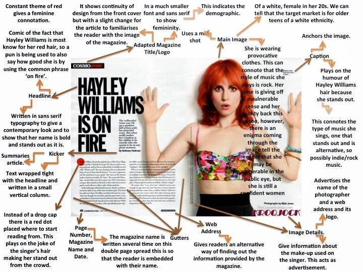
I have chosen this article double page spread with Hayley Williams for Cosmo magazine. I have chosen this one to analyse as she is in a band called Paramore which is who i based my band "Blackout" around. They have the same target audience. 


They layout of this double page spread, is also very simple, but effective as it doesn't look tacky or too busy. It is also effective as the main focus is clearly on her as she takes up half of the double page spread. We can also clearly tell that the magazine is possibly for a younger audience say older teens to mid 20's as there isn't much writing compare to the picture so they wouldn't get bored. Using this analysis i will take it to my Double Page Spread as i don't want mine to look too busy, i want it to look edgy, but simple and effective. So by using minimal colours and only one picture, i hope to achieve this.

Q magazine have used a less conventional approach
to their double page spread layout. One image has been used, however, it is in
the corner (top right) of the page and the text is in columns around it. I have
found this is many of their magazines, not just this one. I like this and will
be using this effect in my double page spread because it stands out and is
unique.


Q have also, a border has been used around the edge of the pages. This is another creative feature of this double page spread that I will be using in my magazine. However, as other magazines (such as Kerrang!) have not used a border, my own template will not look like this one, but a more simple version.
The colour scheme is consistent with the front cover and contents page too as the text is red and black, and the back ground is white. This relationship could convince the reader to keep buying the magazine as it seems very professional and the house style is clear.
Another effect this page has is the stand out image. The lights and colours on the image attract the audience’s attention and it contrasts with the text because is seems to be quite a plain page. I will try to capture a picture with bright sunlight so it lightens up the page as this one has.

This Double Page Spread, like many others, has a distinct layout in the sense that it focuses on placing the image on one side (left) of the page and the text on the other (right). The image here is in black and white which follows the house style and typical colours for this genre. It also makes the ‘L’ behind stand out, but in a way that means the reader can see read the text. Although, it is still clear the main feature of this double page spread is the red ‘L’ (standing for Lady Gaga). I like the use of three main colours for this page, so I will use this in my own double page spread.
Another typical feature of this double page spread is the columns the font is laid out into. I will be using columns in my magazine as most magazines have this layout.
This double page spread has also split up the pages into two sides. This is again done by having a picture on the left hand side of the page and the text on the right hand side. This is effective as it makes it easy to follow; having the text separate from the picture lets the reader focus on each part and is easier to read.
Last but not least is this is this double page spread that i really liked. I will be using this layout for my DPS. I think it is really effective as you have the main focus on the model in the picture covering one whole side. Also on the other side is just text with some bold and laid out appropriately  Overall the effect of this is really effective as it is simple without being boring and attractive to a target audience. I think this would also appeal to my target audience.