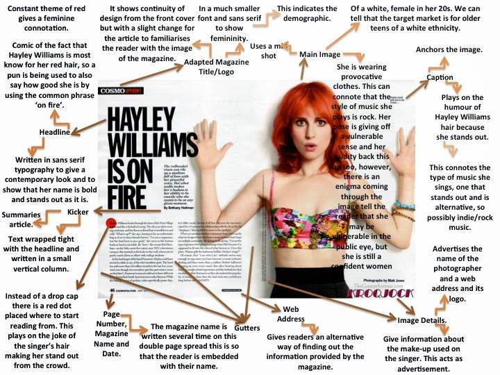
I have chosen this article double page spread with Hayley Williams for Cosmo magazine. I have chosen this one to analyse as she is in a band called Paramore which is who i based my band "Blackout" around. They have the same target audience.
They layout of this double page spread, is also very simple, but effective as it doesn't look tacky or too busy. It is also effective as the main focus is clearly on her as she takes up half of the double page spread. We can also clearly tell that the magazine is possibly for a younger audience say older teens to mid 20's as there isn't much writing compare to the picture so they wouldn't get bored. Using this analysis i will take it to my Double Page Spread as i don't want mine to look too busy, i want it to look edgy, but simple and effective. So by using minimal colours and only one picture, i hope to achieve this.

Q magazine have used a less conventional approach
to their double page spread layout. One image has been used, however, it is inthe corner (top right) of the page and the text is in columns around it. I have
found this is many of their magazines, not just this one. I like this and will
be using this effect in my double page spread because it stands out and is
unique.
Q have also, a border has been used around the edge of the pages. This is another creative feature of this double page spread that I will be using in my magazine. However, as other magazines (such as Kerrang!) have not used a border, my own template will not look like this one, but a more simple version.
The colour scheme is consistent with the front cover and contents page too as the text is red and black, and the back ground is white. This relationship could convince the reader to keep buying the magazine as it seems very professional and the house style is clear.
Another effect this page has is the stand out image. The lights and colours on the image attract the audience’s attention and it contrasts with the text because is seems to be quite a plain page. I will try to capture a picture with bright sunlight so it lightens up the page as this one has.
This Double Page Spread, like many others, has a distinct layout in the sense that it focuses on placing the image on one side (left) of the page and the text on the other (right). The image here is in black and white which follows the house style and typical colours for this genre. It also makes the ‘L’ behind stand out, but in a way that means the reader can see read the text. Although, it is still clear the main feature of this double page spread is the red ‘L’ (standing for Lady Gaga). I like the use of three main colours for this page, so I will use this in my own double page spread.
Another typical feature of this double page spread is the columns the font is laid out into. I will be using columns in my magazine as most magazines have this layout.
This double page spread has also split up the pages into two sides. This is again done by having a picture on the left hand side of the page and the text on the right hand side. This is effective as it makes it easy to follow; having the text separate from the picture lets the reader focus on each part and is easier to read.
Last but not least is this is this double page spread that i really liked. I will be using this layout for my DPS. I think it is really effective as you have the main focus on the model in the picture covering one whole side. Also on the other side is just text with some bold and laid out appropriately Overall the effect of this is really effective as it is simple without being boring and attractive to a target audience. I think this would also appeal to my target audience.


No comments:
Post a Comment