Masthead
The Masthead is in the top left hand corner. It is also partially hidden by the cover model. The Masthead is also in big, bold lettering to allude to its importance and advertise the brand name. Furthermore it is in red to make it stand out and be eye-catching. As it is partially hidden by the cover model it shows that it isn't the main selling point, but is there to signify what magazine it is and for buyers to see it clearly.
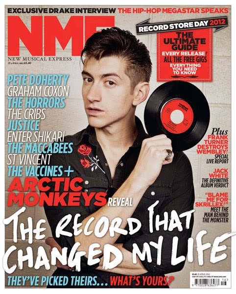
The Masthead is in the top left hand corner. It is also partially hidden by the cover model. The Masthead is also in big, bold lettering to allude to its importance and advertise the brand name. Furthermore it is in red to make it stand out and be eye-catching. As it is partially hidden by the cover model it shows that it isn't the main selling point, but is there to signify what magazine it is and for buyers to see it clearly.
Central Image
The central image is of Arctic Monkeys front man Alex Turner. As seen he is posed holding a record and as he is a famous music person, for the type of music that my magazine is also about it shows he knows what he's talking about. Furthermore he is straight in the middle of the front cover with the text around him, not in front of his face, he's not moving for anything.
The central image is of Arctic Monkeys front man Alex Turner. As seen he is posed holding a record and as he is a famous music person, for the type of music that my magazine is also about it shows he knows what he's talking about. Furthermore he is straight in the middle of the front cover with the text around him, not in front of his face, he's not moving for anything.
The Cover Model
The cover model is Alex Turner of Arctic Monkeys, he is pictured here with a serious and pouty facial expression to iterate that he is a serious musician (which he is) we hardly ever see him laughing in interviews and such. Likewise he is also the cover model as he is undoubtedly good looking, with slick backed hair and dressed in all black. This also might paint him as a "bad boy" and also promotes the image of the type of music he produces. The clothing and hair also make him look fashionable. Similarly dressed in all black makes him look 'edgy' and 'dangerous'. Also with his arms crossed it makes him look unapproachable, but i think this cover image is effective.
The cover model is Alex Turner of Arctic Monkeys, he is pictured here with a serious and pouty facial expression to iterate that he is a serious musician (which he is) we hardly ever see him laughing in interviews and such. Likewise he is also the cover model as he is undoubtedly good looking, with slick backed hair and dressed in all black. This also might paint him as a "bad boy" and also promotes the image of the type of music he produces. The clothing and hair also make him look fashionable. Similarly dressed in all black makes him look 'edgy' and 'dangerous'. Also with his arms crossed it makes him look unapproachable, but i think this cover image is effective.
Anchorage
Pictured is the phrase "The record that changed my life" which is clearly about Alex and his favourite song. Furthermore "Arctic Monkeys reveal" entices a target audience to read the magazine and want to know what it is that they are revealing. Likewise the word "record" with Alex holding a record promotes anchorage between the two.
Pictured is the phrase "The record that changed my life" which is clearly about Alex and his favourite song. Furthermore "Arctic Monkeys reveal" entices a target audience to read the magazine and want to know what it is that they are revealing. Likewise the word "record" with Alex holding a record promotes anchorage between the two.
Secondary Images
There are no secondary images as the main article is about Alex Turner and the Arctic Monkeys so they wanted him to be the main focus.
There are no secondary images as the main article is about Alex Turner and the Arctic Monkeys so they wanted him to be the main focus.
Cover lines
"All the free gigs" promotes what is going on in this genre of music and will get people interested and wanting to buy the magazine. Furthermore "The Macabees, St Vincent, The Vaccines." etc also promotes what this genre of music is, and the most popular band within the genre.
"All the free gigs" promotes what is going on in this genre of music and will get people interested and wanting to buy the magazine. Furthermore "The Macabees, St Vincent, The Vaccines." etc also promotes what this genre of music is, and the most popular band within the genre.
Use of Colour
Through use of colour, such as blue, red, white and black which are the only colours on the front cover. It makes certain things stand out more or less. Such as 'NME' and 'Arctic Monkeys' are in bold font and bright red to make them stand out. Other headlines are then in blue and white as they aren't main features, but still need to be known about.
Through use of colour, such as blue, red, white and black which are the only colours on the front cover. It makes certain things stand out more or less. Such as 'NME' and 'Arctic Monkeys' are in bold font and bright red to make them stand out. Other headlines are then in blue and white as they aren't main features, but still need to be known about.
Font
The different fonts used are also to be eye-catching and intrigue. There are different fonts used some bolder, some thinner and curlier. The more important things are highlighted in a bolder font and the afterthoughts are in a skinnier font.
The different fonts used are also to be eye-catching and intrigue. There are different fonts used some bolder, some thinner and curlier. The more important things are highlighted in a bolder font and the afterthoughts are in a skinnier font.
No comments:
Post a Comment