Showing posts with label Main Tasks. Show all posts

Tuesday, 12 May 2015

Final Version for my Contents Page

 
After receiving some feedback, I have added page numbers, and I have also aligned the text. I have also got rid of extra blank space. I have also cropped my photos to get rid of the boring backgrounds. I have also added page numbers and quotes to my pictures so it is obvious what articles they go with. I have also added page numbers to my articles and changed the font and colour of the "regulars".

Final Version of my Double Page Spread


After receiving some feedback for my Double Page Spread, I realised that I had to much blank space!
So I sorted this by making the bit that says "Black Out" and "The Lights are Off" and by moving them closer and I added a fact file of the band to get rid of the space and make it more interesting.
I also made more space around my quotes. I also added a page number to make it easier to go to that page. I also made a quote larger and moved it to the picture so it tied in with the article.


Final Version Front Cover.

 
After receiving some feedback, I changed the colour of the cover lines on the top left to yellow, with a black outline, to make them standout more. I think this is effective as it makes them stand out more and adds more dimension to my final front cover.
I also added an issue number and date, as originally I had forgotten to do this. I also put it in bright red to make it easier for potential audiences to notice and make it easier to tell what edition it is.
For "Greatest British Bands Ever" I changed it to a bolder red font to make it easier to read, I also moved the words closer together to get rid of wasted space.
I did also move "Live Kasabian" further down so it wouldn't get mistaken as being the connected to the "Album Title." 

Monday, 30 March 2015

Double Page Spread Image Selection Process

I actually didn't use any of these from this set, for my double page spread- because i didn't think the were up to the standard i hoped for. I also didn't think that they portrayed what i wanted to such as the 2nd photograph my friend is smiling and does portray the serious band that i wanted them to. 


Secondly this picture- she is also smiling and i didn't think it was effective- it also doesn't show both of the members.

Final Front Cover


This is my final edition of my front cover. Overall i am really pleased with it and think that I've done quite well. like the colours and throughout my 3 products, there is a a distance house-style of colours that i have used which i think are effective. I have used some conventions such as bolder fonts and colour, however i have also broken one with my cover image. I have broken it by not having either of my cover models facing froward- i did this to portray them as mysterious as their name is 'Blackout'. In conclusion i am happy with this product. 

Double Page Spread (feedback)


This was the first edition of my double page spread, i changed the picture as it was too similar to my front cover version. I also prefer my actual Double Page Spread picture as this one makes the dps seem too 'goth' or grunge and that wasn't what i was aiming for. I was just aiming for alternative or rock/indie, which i think with my final dps i managed. Similarly the colour scheme with this one, combined with the black and white photo lacks something, whereas i think my final version with a semi-coloured photographs works better and 'lifts' the dps as a whole.

Final Double Page Spread.


This is my final Double Page Spread and overall i am really proud and happy of the product i have achieved. I like the editing i did of the photo the best as i made the background black and white, and then edited the two main people in colour. Myth is my magazine and Blackout are my created band. I love the colour scheme, and think that i stuck to some main magazine conventions of my genre with this i.e. the black and red and white. However i also think i broke some conventions by having the 'Chaos' literally looking like Chaos and not being neat and tidy. I had a lot of fun trying to create this product. I think the colours work well and i love the photo is shows what i wanted to- that Blackout are a serious, yet quirky band and i think this will appeal to my target audience.

Contents Page photo selection process 2.


These are some of the photographs to use for my contents page, which i took at the gig i went to. Some of them i really like such as the "KOKO" one at the bottom, also the clear ones of St Raymond (the band). I have used the bottom 3 on my actual contents page. 
However the first three are too blurry, the lighting isn't what i wanted and the view is wrong. So i have used the last 3 for my contents page, as the lighting is decent and i really like those photographs. They are also good to use as they will draw my target audience in as they are a "cool" band to go see. Likewise this will draw my target audience in as they will see that as the creators of the magazine we go to gigs and are interested in the same things as them. Overall i am pleased with this set of photographs and happy with how they turned out. 


Final Contents Page.


Sunday, 29 March 2015

Double Page Spread Analysis

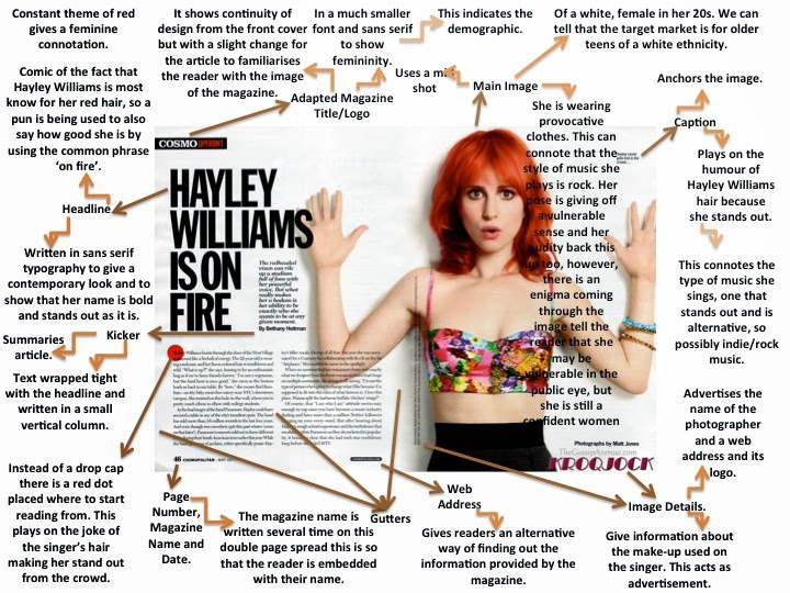
I have chosen this article double page spread with Hayley Williams for Cosmo magazine. I have chosen this one to analyse as she is in a band called Paramore which is who i based my band "Blackout" around. They have the same target audience. 


They layout of this double page spread, is also very simple, but effective as it doesn't look tacky or too busy. It is also effective as the main focus is clearly on her as she takes up half of the double page spread. We can also clearly tell that the magazine is possibly for a younger audience say older teens to mid 20's as there isn't much writing compare to the picture so they wouldn't get bored. Using this analysis i will take it to my Double Page Spread as i don't want mine to look too busy, i want it to look edgy, but simple and effective. So by using minimal colours and only one picture, i hope to achieve this.

Q magazine have used a less conventional approach
to their double page spread layout. One image has been used, however, it is in
the corner (top right) of the page and the text is in columns around it. I have
found this is many of their magazines, not just this one. I like this and will
be using this effect in my double page spread because it stands out and is
unique.


Q have also, a border has been used around the edge of the pages. This is another creative feature of this double page spread that I will be using in my magazine. However, as other magazines (such as Kerrang!) have not used a border, my own template will not look like this one, but a more simple version.
The colour scheme is consistent with the front cover and contents page too as the text is red and black, and the back ground is white. This relationship could convince the reader to keep buying the magazine as it seems very professional and the house style is clear.
Another effect this page has is the stand out image. The lights and colours on the image attract the audience’s attention and it contrasts with the text because is seems to be quite a plain page. I will try to capture a picture with bright sunlight so it lightens up the page as this one has.

This Double Page Spread, like many others, has a distinct layout in the sense that it focuses on placing the image on one side (left) of the page and the text on the other (right). The image here is in black and white which follows the house style and typical colours for this genre. It also makes the ‘L’ behind stand out, but in a way that means the reader can see read the text. Although, it is still clear the main feature of this double page spread is the red ‘L’ (standing for Lady Gaga). I like the use of three main colours for this page, so I will use this in my own double page spread.
Another typical feature of this double page spread is the columns the font is laid out into. I will be using columns in my magazine as most magazines have this layout.
This double page spread has also split up the pages into two sides. This is again done by having a picture on the left hand side of the page and the text on the right hand side. This is effective as it makes it easy to follow; having the text separate from the picture lets the reader focus on each part and is easier to read.
Last but not least is this is this double page spread that i really liked. I will be using this layout for my DPS. I think it is really effective as you have the main focus on the model in the picture covering one whole side. Also on the other side is just text with some bold and laid out appropriately  Overall the effect of this is really effective as it is simple without being boring and attractive to a target audience. I think this would also appeal to my target audience. 


Q Contents Page Analysis/Research. (Prezi)

Tuesday, 25 November 2014

Analysis of Q Music Magazine

Q341_Web

Masthead
The Masthead of the magazine is in the top left corner, so it is visible, but is hidden partly behind the Central Image, perhaps with the thoughts that the central image, with the Foo Fighters being famous enough will attract the audience they want to buy the magazine.

Central Image

The Central Image is of the band the Foo Fighters and mainly the main singer- Dave Grohl. The central image has been taken as it is a certain type of music magazine- rock and indie. So the central image will always be of  performers with that type of genre to their name. The Central Image is also vital to selling the magazine. Buyers or potential buyers of the magazine will look at the central image and if they like that band will most likely buy it.

The Cover Model
The Cover Model is of the band the Foo Fighters and mainly the main singer- Dave Grohl. The Cover Model has been chosen as it is a certain genre of music they perform. The Cover Model has been posed in a way that makes the lead singer obviously the lead singer. He is posed to look serious as he sint smiling and has his hands clasped to look important. However the fact that he is kneeling makes him look more relaxed. The rest of the band are also photographed behind him to include them.

Anchorage
Having "Foo Fighters" in a simple black font, with a grey background by the Masthead and also by the image, shows that there is a link between the two. This is effective as it makes it obvious who they are. Similarly "I had another life 25 years ago it was turned upside down" also anchors the photo, Dave Grohl looks serious, the statement is serious.

Secondary Images
There is a smaller photograph of Prince, in the right hand corner, almost as an extra selling point. To further attract fans of other music. This is the only secondary image. This is also near the Masthead and also has a cover line, this has been used as an extra feature/selling point.

Cover lines
There are cover lines such as "their new album, haunted by the past". This cover line in particular works well with the theme of the magazine- all about the Foo Fighters. Furthermore is also works well with the main cover image as it is talking about them. The cover lines are effective and work well to draw a reader in as we want to know what haunted them. Likewise "Noel Returns" also does this. We want to know about Noel's return, why he's doing it, what for and when. It catches peoples intrigue. 

Use of Colour
The colours used are all very basic but a bolder colour such as red is used to make certain things such as "31" stand out. To make this more well known that there are 31 pages of essential reviews. There are also colours used such as white, black, grey, red. The plainer colours such as grey, black and white are then complimented by the pop of red throughout the magazine. This colour scheme is also common throughout the rest of Q. The use of red also seems to highlight the angrier statements. Red is quite an angry colour or can be and perhaps highlights the type of music this magazine is about.


Font 
The Fonts of Q are all bold, so to make a bigger statement out of each headline. The fonts are all in red, white, black and are bold. The majority of them stand out, as each of them are a selling point and have been used for this. The highlighting in opposing colours i.e. the Foo Fighters in black with a grey background, is also to make it stand out further. Each font has been picked to suit each headline, but the majority of them look the same.