Monday, 30 March 2015

Double Page Spread Partially Constructed


This is my first draft of my double page spread, and as you can see i have changed A LOT!
After much evaluation and feedback i have changed my layout, my tagline, my picture and the general font/colours. I wanted the layout to be different as i thought it would be more effective to have the photo on the right, so it will be the first thing people see. Secondly i wanted the slogan to be bigger and 3d, so i changed that. And i also have changed the actual image and the wording. In general i prefer my finished product as i think it looks more professional.


Contents Page Partial Production Feedback


With this being my contents page partially constructed, i asked for feedback from fellow classmates and what i got was that they thought my pictures shouldn't all be on one side- so in my final product i have moved them. Also in my final product i haven't used any of these same photos- i didn't think they promoted what i wanted in my magazine and found them too commercial. So instead i have used photos from the gig that i went to. Overall as a first draft it isn't awful, but i much prefer the improvements i made and my finished product. 

Double Page Spread Image Selection Process

I actually didn't use any of these from this set, for my double page spread- because i didn't think the were up to the standard i hoped for. I also didn't think that they portrayed what i wanted to such as the 2nd photograph my friend is smiling and does portray the serious band that i wanted them to. 


Secondly this picture- she is also smiling and i didn't think it was effective- it also doesn't show both of the members.

Final Front Cover


This is my final edition of my front cover. Overall i am really pleased with it and think that I've done quite well. like the colours and throughout my 3 products, there is a a distance house-style of colours that i have used which i think are effective. I have used some conventions such as bolder fonts and colour, however i have also broken one with my cover image. I have broken it by not having either of my cover models facing froward- i did this to portray them as mysterious as their name is 'Blackout'. In conclusion i am happy with this product. 

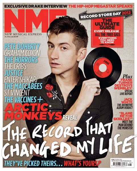
Analysis of NME music magazine.


Masthead
The Masthead is in the top left hand corner. It is also partially hidden by the cover model. The Masthead is also in big, bold lettering to allude to its importance and advertise the brand name. Furthermore it is in red to make it stand out and be eye-catching. As it is partially hidden by the cover model it shows that it isn't the main selling point, but is there to signify what magazine it is and for buyers to see it clearly.

Central Image
The central image is of Arctic Monkeys front man Alex Turner. As seen he is posed holding a record and as he is a famous music person, for the type of music that my magazine is also about it shows he knows what he's talking about.  Furthermore he is straight in the middle of the front cover with the text around him, not in front of his face, he's not moving for anything.

The Cover Model
The cover model is Alex Turner of Arctic Monkeys, he is pictured here with a serious and pouty facial expression to iterate that he is a serious musician (which he is) we hardly ever see him laughing in interviews and such. Likewise he is also the cover model as he is undoubtedly good looking, with slick backed hair and dressed in all black. This also might paint him as a "bad boy" and also promotes the image of the type of music he produces. The clothing and hair also make him look fashionable. Similarly dressed in all black makes him look 'edgy' and 'dangerous'. Also with his arms crossed it makes him look unapproachable, but i think this cover image is effective.

Anchorage
Pictured is the phrase "The record that changed my life" which is clearly about Alex and his favourite song. Furthermore "Arctic Monkeys reveal" entices a target audience to read the magazine and want to know what it is that they are revealing. Likewise the word "record" with Alex holding a record promotes anchorage between the two.

Secondary Images
There are no secondary images as the main article is about Alex Turner and the Arctic Monkeys so they wanted him to be the main focus.

Cover lines
"All the free gigs" promotes what is going on in this genre of music and will get people interested and wanting to buy the magazine. Furthermore "The Macabees, St Vincent, The Vaccines." etc also promotes what this genre of music is, and the most popular band within the genre.

Use of Colour
Through use of colour, such as blue, red, white and black which are the only colours on the front cover. It makes certain things stand out more or less. Such as 'NME' and 'Arctic Monkeys' are in bold font and bright red to make them stand out. Other headlines are then in blue and white as they aren't main features, but still need to be known about.

Font
The different fonts used are also to be eye-catching and intrigue. There are different fonts used some bolder, some thinner and curlier. The more important things are highlighted in a bolder font and the afterthoughts are in a skinnier font.

Double Page Spread (feedback)


This was the first edition of my double page spread, i changed the picture as it was too similar to my front cover version. I also prefer my actual Double Page Spread picture as this one makes the dps seem too 'goth' or grunge and that wasn't what i was aiming for. I was just aiming for alternative or rock/indie, which i think with my final dps i managed. Similarly the colour scheme with this one, combined with the black and white photo lacks something, whereas i think my final version with a semi-coloured photographs works better and 'lifts' the dps as a whole.

Final Double Page Spread.


This is my final Double Page Spread and overall i am really proud and happy of the product i have achieved. I like the editing i did of the photo the best as i made the background black and white, and then edited the two main people in colour. Myth is my magazine and Blackout are my created band. I love the colour scheme, and think that i stuck to some main magazine conventions of my genre with this i.e. the black and red and white. However i also think i broke some conventions by having the 'Chaos' literally looking like Chaos and not being neat and tidy. I had a lot of fun trying to create this product. I think the colours work well and i love the photo is shows what i wanted to- that Blackout are a serious, yet quirky band and i think this will appeal to my target audience.