Showing posts with label Research. Show all posts

Monday, 30 March 2015

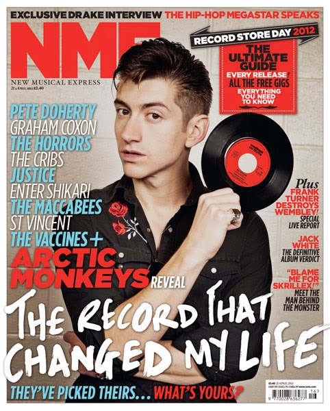
Analysis of NME music magazine.


Masthead
The Masthead is in the top left hand corner. It is also partially hidden by the cover model. The Masthead is also in big, bold lettering to allude to its importance and advertise the brand name. Furthermore it is in red to make it stand out and be eye-catching. As it is partially hidden by the cover model it shows that it isn't the main selling point, but is there to signify what magazine it is and for buyers to see it clearly.

Central Image
The central image is of Arctic Monkeys front man Alex Turner. As seen he is posed holding a record and as he is a famous music person, for the type of music that my magazine is also about it shows he knows what he's talking about.  Furthermore he is straight in the middle of the front cover with the text around him, not in front of his face, he's not moving for anything.

The Cover Model
The cover model is Alex Turner of Arctic Monkeys, he is pictured here with a serious and pouty facial expression to iterate that he is a serious musician (which he is) we hardly ever see him laughing in interviews and such. Likewise he is also the cover model as he is undoubtedly good looking, with slick backed hair and dressed in all black. This also might paint him as a "bad boy" and also promotes the image of the type of music he produces. The clothing and hair also make him look fashionable. Similarly dressed in all black makes him look 'edgy' and 'dangerous'. Also with his arms crossed it makes him look unapproachable, but i think this cover image is effective.

Anchorage
Pictured is the phrase "The record that changed my life" which is clearly about Alex and his favourite song. Furthermore "Arctic Monkeys reveal" entices a target audience to read the magazine and want to know what it is that they are revealing. Likewise the word "record" with Alex holding a record promotes anchorage between the two.

Secondary Images
There are no secondary images as the main article is about Alex Turner and the Arctic Monkeys so they wanted him to be the main focus.

Cover lines
"All the free gigs" promotes what is going on in this genre of music and will get people interested and wanting to buy the magazine. Furthermore "The Macabees, St Vincent, The Vaccines." etc also promotes what this genre of music is, and the most popular band within the genre.

Use of Colour
Through use of colour, such as blue, red, white and black which are the only colours on the front cover. It makes certain things stand out more or less. Such as 'NME' and 'Arctic Monkeys' are in bold font and bright red to make them stand out. Other headlines are then in blue and white as they aren't main features, but still need to be known about.

Font
The different fonts used are also to be eye-catching and intrigue. There are different fonts used some bolder, some thinner and curlier. The more important things are highlighted in a bolder font and the afterthoughts are in a skinnier font.

Sunday, 29 March 2015

Analysis of Billboard Music Magazine


Masthead
The masthead of the magazine is actually hidden behind the cover model. This is because the magazine is most likely already very well known and has  apopular following. Similarly the cover model is the main selling point so it doesn't matter that the masthead is hidden. The masthead that i can see is black but with yellow and blue filling in the gaps. This makes the masthead look bolder and therefore more eye-catching.

Central Image
The central image is right in the middle of the cover, and is the only image on the front cover. It also covers most of the front cover.

The Cover Model
The cover model is posing suggestively, with cleavage on show to look perhaps more fun and less conservative. This might also be to break gender barriers, as it suggests that she is confident in herself to do so. She is also wearing crazy coloured makeup such as blue eye liner with bright pink lipstick. This is very typical of Katy Perry and goes with her 'image'. Her hair and makeup has also been done appropriately to advertise her as a young and fun model. The cover model is also wearing earrings, which make her look expensive and worth buying the magazine.

Anchorage
"Women In Music" is the main anchorage above the cover model and the masthead. This anchorage is particularly important as it shows what this issue of the magazine is about. If this sort of thing is interesting to a particular target audience, then it is important to have it bigger to attract the audience. The Anchorage on this issue is the main selling point as people are going to want to know the main women in music to look out for.

Secondary Images
There are no secondary images on the front cover, this is most likely done so all of the intrigue and attention is on the main cover model.

Cover lines
Cover lines such as "Woman of the Year", draw readers in as this is a pretty big expectation to live up to, so must be someone important. This also draws attention to the cover model and main image as it is related to her. This use of cover line is important as the audience know what the relevance is, all of these things come as a package in selling this magazine issue.

Use of Colour
The colours used are baby pink, black, with pops of yellow and blue. The baby pink matches her lipstick and the blue of the cover lines matches her eyeliner. This effect makes the overall effect more enticing and promotes interest. The use of pink also alludes to femininity and being girly. These colours are clearly aimed at the female target audience. The colours all work and keep the magazine looking fresh. They aren't typical colours to put with each other but work on this magazine front cover.

Font
The fonts used are all bold and vary in size. Different fonts have also been used to make it more interesting. "Woman of the Year" is also in a bigger font to make this article the main feature. Different fonts have been used to make the magazine more interesting,  and for certain articles to get more attention by making the font bigger. 

Planning for the photoshoot of my Double Page Spread

Location: 
My location for my photo shoot will using a lift. I am looking for a lift to use as i want the lift to be resembling them "going up" in the music industry and their journey. It will be symbolic. I think this is a good idea as it shows originality and creativity. I will also be able to get a mirror shot in the background which makes it look more than to dimensional and interesting. 

The Cover Model: 
What will they be wearing?
I want my band members to be wearing clothes that show their attitude and type of music. I will have the band dressed in jeans and plain t-shirts with perhaps converse or vans footwear. I will do this because I want them to look like the stereotypical rock/grunge band in all black, dark blue and grey.

Facial Expressions;
I want the cover models facial expressions to be serious and one of them to look playful or smirking. I want them to look brooding and to intrigue people. This is a band that are making their mark on the music industry and are here to stay and i want their facial expression to reflect that.


Body Language/Posture
The body language that I want them to use will be serious and most likely hands up or arms crossed. I will have some of the band members with their arms crossed whilst have some with their hands in their pockets. This makes them look like the stereotypical teenage band. 


Weather;
The weather won't play a part as it will be inside a lift, i will however have to be considerate of the lifting i am using, as i will have to choose the right camera settings.


Miscellaneous;
I am going to be taking the photos with a Canon 1200D as i want detailed shots for my magazine, that look professional. 

Planning for Contents Page (photoshoot and ideas)

Location;
Seeing as i have three different photos on my contents page i have three different locations. One of these was at a concert i went to (St Raymond), i wanted this to be on my contents page as it is a genuine photograph from the type of band that my target audience listen to. Also it would show value and look more realistic than if i set it up, it will also attract a target audience as they will see that there are gig reviews in the magazine. Secondly is a picture of my younger sister as an artist- this is to represent diversity within the magazine and too show something different, this will be shot in my house with a white wall for simplicity. The last location i am using is also a white wall with one of my friends as a rock/alternative singer also. I will take photos from a number of different angles to get a variety of shots. The location will play a key part in my photo-shoot as it sets the mood for the photos. So with there being a gig it creates a fun, grungy atmosphere with the lighting/darkness. Whereas the white wall creates simplicity. 

Body Language;
As with the other photo-shoots the body language used by the models will be relatively care free and non-imposing. 
I wanted this posture because it links in with the darker theme of rock and the aura that that specific genre of music creates. The models will either stand with their arms crossed or lean against an object as well as this the camera angles that i will use will be low angle and eye level. I am using low angles to reflect the position of authority and power that the artists have over the reader.

Facial Expressions;
The  models facial expressions will either be blank and serious or smiling/smirking to show a playful side as i don't want it to all be serious. The facial expression used by the model is very important as it helps create the image that I want, which is that of a fun by serious side as well.
.
Weather;
The weather will not play a major part in the photo-shoot as it will take place inside, so i don't have to worry about that. I do however need to consider lighting as inside the gig it will be dark with not much light. 

Other;
The photos will be taken using a Canon 1200D and a Macbook Air to edit them. 


I want my Contents Page to look professional and intriguing but also simple as i don't want it to look tacky. 

That is why  i really like the Q contents page and will most likely take this for inspiration. 

Double Page Spread Analysis

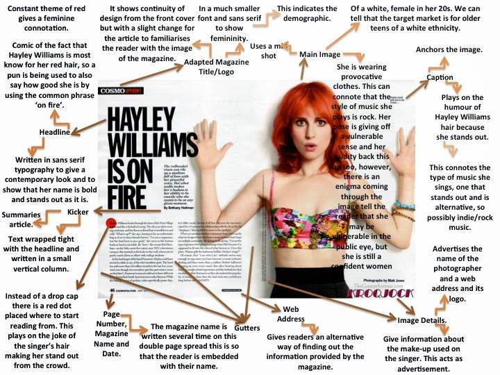
I have chosen this article double page spread with Hayley Williams for Cosmo magazine. I have chosen this one to analyse as she is in a band called Paramore which is who i based my band "Blackout" around. They have the same target audience. 


They layout of this double page spread, is also very simple, but effective as it doesn't look tacky or too busy. It is also effective as the main focus is clearly on her as she takes up half of the double page spread. We can also clearly tell that the magazine is possibly for a younger audience say older teens to mid 20's as there isn't much writing compare to the picture so they wouldn't get bored. Using this analysis i will take it to my Double Page Spread as i don't want mine to look too busy, i want it to look edgy, but simple and effective. So by using minimal colours and only one picture, i hope to achieve this.

Q magazine have used a less conventional approach
to their double page spread layout. One image has been used, however, it is in
the corner (top right) of the page and the text is in columns around it. I have
found this is many of their magazines, not just this one. I like this and will
be using this effect in my double page spread because it stands out and is
unique.


Q have also, a border has been used around the edge of the pages. This is another creative feature of this double page spread that I will be using in my magazine. However, as other magazines (such as Kerrang!) have not used a border, my own template will not look like this one, but a more simple version.
The colour scheme is consistent with the front cover and contents page too as the text is red and black, and the back ground is white. This relationship could convince the reader to keep buying the magazine as it seems very professional and the house style is clear.
Another effect this page has is the stand out image. The lights and colours on the image attract the audience’s attention and it contrasts with the text because is seems to be quite a plain page. I will try to capture a picture with bright sunlight so it lightens up the page as this one has.

This Double Page Spread, like many others, has a distinct layout in the sense that it focuses on placing the image on one side (left) of the page and the text on the other (right). The image here is in black and white which follows the house style and typical colours for this genre. It also makes the ‘L’ behind stand out, but in a way that means the reader can see read the text. Although, it is still clear the main feature of this double page spread is the red ‘L’ (standing for Lady Gaga). I like the use of three main colours for this page, so I will use this in my own double page spread.
Another typical feature of this double page spread is the columns the font is laid out into. I will be using columns in my magazine as most magazines have this layout.
This double page spread has also split up the pages into two sides. This is again done by having a picture on the left hand side of the page and the text on the right hand side. This is effective as it makes it easy to follow; having the text separate from the picture lets the reader focus on each part and is easier to read.
Last but not least is this is this double page spread that i really liked. I will be using this layout for my DPS. I think it is really effective as you have the main focus on the model in the picture covering one whole side. Also on the other side is just text with some bold and laid out appropriately  Overall the effect of this is really effective as it is simple without being boring and attractive to a target audience. I think this would also appeal to my target audience. 


Q Contents Page Analysis/Research. (Prezi)

Saturday, 28 March 2015

Lifestyle Questionnaire Answers/Feedback.

How do you buy music? 
ITunes  x1
CD x2
Downloads 

Where do you mainly listen to Music?
School x1
Home 
on the go x2

What Genre of Music do you mainly listen to?
Rock x1
Alternative x2
Pop
Rap
Hip Hop

Do you listen to alternative music often?
No 
Sometimes 
Yes x1
All the time x2 

How often do you go to concerts/gigs per year?
1-5 x1
6-10 
11-15 x2
16-20 
20+ 

How often do you buy music? 
Daily x1
Weekly x2
Monthly 
whenever I have the time 

How many hours of music do you listen to daily?
0-1hr x1
2-3 hrs 
4-6 hrs x2
7+hrs 

How many songs roughly do you have on your iPod/music Player?
0-250 songs x1
260-500 
510-1000 
1000+ x2

How many festivals yearly do you attend?
1-2
3-4 two out of 3 attended 3-4 a year. 
5-6
7+

What do you think of the magazine’s cover photo?
Terrible 
Bad 
Okay x3 
Excellent 

What do you think of the colour scheme of the front cover?
Terrible 
Bad 
Okay 
Excellent x3

Do you think the price of the magazine is fair (£2.75)?
No 
Maybe  
Yes x3 they all agreed 

From my questionnaire i can gather that i have targeted the right audience. All 3 listen to rock and alternative music which is the audience genre for my magazine. All 3 found the price of the magazine fair which is good as the 3 people i gave the questionnaire to were of the age group i am targeting. They all liked the font colours and the cover image. And all 3 attend some form of festivals or gigs every year which is also in my criteria for my intended audience. Overall i am very happy with the results of the questionnaire as they have come back positive and i have matched my criteria to my front cover accurately. 

Monday, 23 March 2015

Annotation of a non-music magazine.


Masthead
The Masthead is actually in the left hand corner up until the middle point. rather than being straight in the middle, like most magazine front covers. I think this has been done, so as to break conventions and make the magazine appear different. The masthead is in big, bold lettering and is bright red. This is to draw in potential and existing readers of the magazine. The masthead is also catchy and short. As well as being two letters that stand for the actual name which is Gentlemen's Quarterly. This has been done, as the magazine assumes people who read it, are regulars and already know/enjoy it. 

Tagline
Such as "conference smackdown" illustrates that people who are interested in politics will also want this issue of GQ. It has been done like this because as this tagline is near the Masthead it will attract and intrigue potential buyers. Various other tagline have also been used. A convention has been bent slightly as the taglines actually don't mention Liam or One Direction. You only see it underneath the Central Image. 

Central Image 
The central image is of Liam Payne from boyband One Direction. He is the centre of the magazine. In this edition of GQ all 5 members had a different issue to themselves. (As pictured above). So as too attract more sales, as fans of the band would most likely buy the issue with their favourite member. 

The Cover Model
The central image is of Liam from One Direction. He has been posed in a way that makes him look like a serious artist, and a serious person. He isn't smiling and is wearing a formal looking coat. Similarly he is wearing all black adding to a grown up, serious feel. I think he has been posed like this to make him and One Direction appear more grown up than ever before. Also they aren't the usual type of people to appear on GQ- so have been styled and positioned in a way that will make readers of the magazine intrigued in how different they look. They are also being represented in a way that won't attract to their usual target audience. For example teenage girls would want to see them all smiling and happy. Whereas this is for a Gentleman's magazine, so to attract the same level of readership, will need to be similar to the usual types of cover model's. 

Anchorage 
Anchorage between the cover image and a cover line has been used. Such as the "Groupies?, you'll get me in trouble" Perhaps this quote has been used to either shock or intrigue or both. It makes him seem more rock and roll as oppose to sugar sweet boy band image. Likewise with "heavier, rockier, cooler" this also matches and goes with the main anchorage. 

Secondary Images 
Liam is the only image, and there are no other images on the front cover. This is so the main focus will be on the cover model and central image. 

Coverlines 
Such as "heavier, rockier, cooler" are used so as to promote different types of people to read about One Direction. Likewise  "autumn style special" and "winterise your wardrobe" also will appeal to readers who want fashion tips for the season that was appropriate at the time. I would say with taglines such as this GQ was for the fashion forward man. 
"Groupies?, you'll get me in trouble" also alludes to a different side of One Direction that perhaps other people will be interested in. Using this quote we assume that in order to find out the rest this will be in the magazine, and you have to buy it to read more. So this is used to intrigue and attract buyers. 

Use of Colour
The use of colour is actually pretty classic-grey, black, white and red. I think this has been done to keep  the front cover looking classy and but bold, which i think is what GQ are about. All whilst keeping it from looking boring with the hint of red, placed around the front cover. With the actual masthead being in big,bold red lettering for emphasis,  Specific things are red such as "GQ" also "Liam" is in big, bold, white lettering to add emphasis and draw attention. If an audience saw it and saw the "Liam" and then the cover image and still didn't know who it was, they might be intrigued to buy, read and find out.

Font 
Certain fonts have been used for certain tagline and cover lines. The actual Masthead itself is a big, bold font so to make it visible and attractive to buyers. Furthermore some cover lines are also in red and some in white to make the cover look interesting and for certain phrases to stand out more. 


Friday, 6 February 2015

How magazines make Money and the Structural Triangle

Most magazine publishers rely on primarily advertising revenue as a significant part of their profit. A small minority of the money made on magazines is due to the subscriptions. However without advertising all lifestyle and music magazines would not be able to survive. Advertisers often want to target their products at particular audiences.  Various magazine publishers will have specific niche markets this allows them to communicate advertisements to this target audience which means more sales and successful sales for advertisers which will make them want to advertise more. The magazine producer will attempt to seal their readership to the advertisers. 
The three factors which form the basis of the business model for model of media producers are advertisers, readership and circulation. 

Example:
The readership for Marie Claire is described by the magazine publisher (IPC) 
-       ABC1 professional women aged 25-34

When GIVENCHY decide to buy a full page ad I Marie Claire for £17,000 they do this as they believe that the magazine will be bought by 280’000 high class women below 40 with a good level of disposable income. 

The main sources of income for magazines are shown in the structural triangle:


The Structural Triangle:

For my research i looked at two interpretations of the Structural Triangle; one being Maslow's Hierarchy of Needs and the second being the Triangle of Oppression.Maslow's Hierarchy of Needs:Maslow wanted to understand what motivates people, he believed that people possess a set of motivation systems unrelated to rewards or unconscious desires. He stated people are motivated to achieve certain needs, when we fulfill each one we move on and seek the next one. When these needs are unmet the desire to fulfill them becomes stronger the longer they are unmet i.e the longer someone goes without food the hungrier they become. We must satisfy  the lower basic needs before moving on. Every person has the capability to move up the hierarchy however that progress is often paused by failures such as divorce, loss of a job. 
The Triangle of Oppression:The Triangle of Oppression enables us to examine our attitudes beliefs and behaviors within asocial context rather than as merely individuals. The Triangle ofOppression gives us a way to begin engaging ourselves in a social justice processes.The Triangle of Oppression enables us to think more critically about the powerful ideas aboutdifference that exist in society, and that are used to exploit those differences within the systemsof society.


One of the main reasons how magazines make money is due to understanding their target audience. By understanding their audiences wants and needs it allows them to successfully expand their readership. They are able to pinpoint their needs by providing demographics such as the audience’s geo-location and traffic sources. Secondly they use social media to their advantage, sites such as Facebook and Twitter are the best and biggest social media channels for audience development. For example, when they post an update on a new issue that’s out, their readers can share the issue to their chosen social media site. 
Thirdly they make the magazine available across multiple platforms. Such as smart phones and tablets to read and access their media online. Fourth they set up a magazine subscription for their readers, such as a free yearly subscription, it solidifies readership and attracts advertisers. Lastly they make a media kit- this provides information about the readers, a sample of the publication, how it's distributed and information about advertising. E.g. how much a quarter, half-page and full page ad costs. 


Rate Cards and Potential Advertisements.


Here is an example of a real rate card for NME magazine: 


This is the rate card for my magazine:


Potential companies that would want to advertise in my magazine: 


I think one company that would be interested in advertising would be Amazon as you can now stream music from them. Them advertising in my magazine would benefit them as my magazine is for younger people who this might appeal to. 


Secondly is the Isle of Wight festival, as the readers of my magazine are the type of people to go this festival. Them advertising in my magazine would encourage more people to go. It is a popular event and would attract interest from this. 


Thirdly, is Sony Music label. The type of people that read my magazine, might be interested in getting a record label deal and/or prodding music. Sony advertising would benefit them as it would help them to become more well known and find new artists. 


Once again, another festival that would benefit from advertisement in my magazine is the Reading and Leeds music festival. The two festivals i have mentioned, my target audience is based around the type of people who would go to these two popular festivals. These festivals also include artists similar to how i imagine mine to be. 


Lastly, is Beats, headphone company. I think this would include popular advertisement as the people who read my magazine are avid music listeners and are never seen without their headphones. Including Beats could increase their sales, as well as be intriguing to my readers. 

Tuesday, 25 November 2014

Analysis of Q Music Magazine

Q341_Web

Masthead
The Masthead of the magazine is in the top left corner, so it is visible, but is hidden partly behind the Central Image, perhaps with the thoughts that the central image, with the Foo Fighters being famous enough will attract the audience they want to buy the magazine.

Central Image

The Central Image is of the band the Foo Fighters and mainly the main singer- Dave Grohl. The central image has been taken as it is a certain type of music magazine- rock and indie. So the central image will always be of  performers with that type of genre to their name. The Central Image is also vital to selling the magazine. Buyers or potential buyers of the magazine will look at the central image and if they like that band will most likely buy it.

The Cover Model
The Cover Model is of the band the Foo Fighters and mainly the main singer- Dave Grohl. The Cover Model has been chosen as it is a certain genre of music they perform. The Cover Model has been posed in a way that makes the lead singer obviously the lead singer. He is posed to look serious as he sint smiling and has his hands clasped to look important. However the fact that he is kneeling makes him look more relaxed. The rest of the band are also photographed behind him to include them.

Anchorage
Having "Foo Fighters" in a simple black font, with a grey background by the Masthead and also by the image, shows that there is a link between the two. This is effective as it makes it obvious who they are. Similarly "I had another life 25 years ago it was turned upside down" also anchors the photo, Dave Grohl looks serious, the statement is serious.

Secondary Images
There is a smaller photograph of Prince, in the right hand corner, almost as an extra selling point. To further attract fans of other music. This is the only secondary image. This is also near the Masthead and also has a cover line, this has been used as an extra feature/selling point.

Cover lines
There are cover lines such as "their new album, haunted by the past". This cover line in particular works well with the theme of the magazine- all about the Foo Fighters. Furthermore is also works well with the main cover image as it is talking about them. The cover lines are effective and work well to draw a reader in as we want to know what haunted them. Likewise "Noel Returns" also does this. We want to know about Noel's return, why he's doing it, what for and when. It catches peoples intrigue. 

Use of Colour
The colours used are all very basic but a bolder colour such as red is used to make certain things such as "31" stand out. To make this more well known that there are 31 pages of essential reviews. There are also colours used such as white, black, grey, red. The plainer colours such as grey, black and white are then complimented by the pop of red throughout the magazine. This colour scheme is also common throughout the rest of Q. The use of red also seems to highlight the angrier statements. Red is quite an angry colour or can be and perhaps highlights the type of music this magazine is about.


Font 
The Fonts of Q are all bold, so to make a bigger statement out of each headline. The fonts are all in red, white, black and are bold. The majority of them stand out, as each of them are a selling point and have been used for this. The highlighting in opposing colours i.e. the Foo Fighters in black with a grey background, is also to make it stand out further. Each font has been picked to suit each headline, but the majority of them look the same.


Semiotic Analysis of RockSound music Magazine.


Masthead
The Masthead of Rocksound has been chosen carefully to sell the Magazine and to capture the eye of potential buyers. "Rocksound" indicates the type of music potential buyers might like. The font itself is black which is a neutral but bold colour suggesting that the magazine could be for both genders. The Masthead is also very simple yet effective as it stands out against a white background and draws the readers in.

Tagline
There are several taglines such as "I'm one of a kind...Gerard Way" not only does this relate to the cover model which is in fact Gerard Way but it entices fans of Gerard Way to want to buy the magazine as they will want to know what he says. They also have other taglines, which are different bands names to advertise and promote these bands to people that might want to read or buy the magazine. The Taglines also give an indication of the type of people who might be interested in the magazine-the people who like the bands displayed as Taglines.

Cover Model
The Cover Model is the main focus , being a well known person in the music genre he is-which Gerard himself describes as "violent-pop" will attract a certain audience as the band he is from My Chemical Romance might only appeal to a certain type of person of certain ages and stereotypes. On this edition of Rocksound especially, he is presented in a way that suggests he is a strong and successful individual. And although his music might only appeal to a certain group of people, he appears neutral and conservative.

Central Image
The central image and only image on the front cover is the cover model Gerard Way. This gives the impression to potential buyers that he will be heavily featured in this issue. It also iterates his importance and him as an important figure in this genre of music. 

Anchorage
"I'm one of a kind". This anchorage has been used to link the central image to an article within the magazine. This anchorage of one of  a kind, also connotes that this magazine issue will be one of a kind. Readers will be drawn in with this type of anchorage.

Cover lines
Cover lines have been used to sell contents of the magazine. "His incredible return" also illustrates what people think of him. Fans will also be encouraged to buy this particular issue as they will also want to know every detail of his return. There are quite a few cover lines, and the magazine does look busy, not in a bad way. This is to show case features that will entice buyers.

Secondary images
There aren't any secondary images used on the front cover. The central image is the only one. I think this was done to keep the main focus on the cover model. Also this enables there to be more cover lines, to advertise the content. No use of other images enables Gerard Way to be the focus, and this also acts as a selling point- for fans of him who will buy the magazine.

 
Font
Use of Font is also effective. The bold Masthead stands out as it is distinctive and edgy. The fonts all match and coincide with one another. None of them look out of place or too different from another. The fonts looks well put together.

Use of Colour
The colours used are predominately: black, white, red and with a splash of yellow. This is too make the magazine seem bold and interesting, without having to use a lot of colour. If too much colour was used, as well as the amount of cover lines i think the magazine would look too busy. The colours used are bold and effective though. 


Annotation of a non-music Magazine.

Deconstruction of a Magazine


Masthead
It takes a secondary spot in the magazine with the central image being a well known pop star as the main focus. The Masthead is also very plain as it is already a well known magazine. It will be the main selling point of this magazine. It takes a back step to let the cover model take the stage and sell the magazine.

Tagline
There are several tag lines with similar subject matters to attract to a wide variety of people within a certain market. For example "strong and sexy suits" gives the impression to strong independent females that can dress for the office but still look chic. Another example is "Queen B!" Beyonce is on the front cover represented as a courageous independent women, so this will sell to ladies who not only like Beyonce and her music but perhaps admire her as an individual as well as her success. The tag lines are all based around similar things such as "shockingly chic accessories" attracting the fashion conscience. Not only that but "how to repair winter-damaged skin" would also appeal to everyone as no one can escape the elements.

Cover Model
Beyonce is the cover model, being a well known person globally she will attract a wide audience as she appeals to most people of all ages and stereotypes. On this edition of Vogue especially, she is presented in a way that suggests she is a strong and successful individual. The pose she is doing whilst still remaining attractive doesn't come across as provocative, as it is the front of a ladies magazine. So rather than making her aesthetically pleasing to men, she is presented in a way that is relatable to women. She is also dressed rather demurely and not suggestive, whilst remaining fashionable. Her makeup is also done and her hair perfectly coiffured, giving the impression of a respectable lady.

Central Image
The Central Image is Beyonce, as the magazine wants her to be the main selling point and feature of the front cover. The central image is obviously the main selling point of the magazine, as she even covers the masthead of the magazine. People know who she is, and will be willing to buy the magazine for two reasons: they love the front cover model and love the magazine.

Anchorage
There is particular anchorage such as "Queen B!" this links to the cover image, and is also a play on words, with Beyoncé's name and illustrating her as the queen.

Cover lines
There are also cover lines such as "strong and sexy suits". This magazine appeals to women in particular as the word "strong" will make women feel empowered and "sexy" also draws readers in as what women wouldn't want to feel sexy and strong in a suit. This could also suggest female empowerment in the workplace.

Secondary images
There are no secondary images, this clearly illustrates that they wanted Beyoncé to be the main selling point of this particular issue- for fans of Beyoncé especially.

Font
Basic fonts are used, and nothing stands out. It all appears to be the same font, just different sizes, to make certain things stand out more. Such as the tagline advertising Beyoncé is bigger than some of the other features, as she is the key selling point.

Use of Colour
The use of colour is actually pretty basic-grey, black, white and red. I think this has been done to keep  the front cover looking classy and elegant. All whilst keeping it from looking boring with the hint of red, placed around the front cover. Specific things are red such as "618". To advertise the various features within the magazine.